Monday, April 27, 2015

When will the NBA Points Per Game Record be Broken?

With the NBA playoffs underway and recently inspired by a phenomenal visualization by the New York Times on Major League Baseball records, I decided to research the top NBA records. Using Basketball-Reference, I scraped the site for leaders and then plugged it into a visualization, first in R using ggplot2, and then I decided to give it the full Tableau treatment.
 Some key takeaways: no one is breaking Wilt's points records and rebounding records are unlikely to fall either. However, we are living in age of high efficiency seen by good shooting and player efficiency metrics.
I also made the viz more interactive than the NYT version- you can type in the name of a player and he will show up as a star on the viz if he is one of the top 250 all time leaders in the statistic .Doing this you can see how dominant stars like Michael Jordan and Magic Johnson were in their prime.  I also added a trend line and annotations.
Purple points were records at the time they were set.

 CLICK HERE TO INTERACT WITH THE VIZ

 CLICK HERE TO INTERACT


 Enjoy and you can see the full code for the scraper/data munging on Github here.

Monday, March 17, 2014

March Madness 2014: How The Top Contenders Stack Up to Past Final Four Teams

My favorite time of the year is here- March Madness. Yes, my favorite team got screwed stuck in the toughest bracket and I'm relatively low on optimism this year, but everyone is saying that the tournament will be wide open and as always I'll be watching every single game this weekend.
When looking at the brackets, I started to wonder how this year's teams compare to recent Final Four teams.  Using the wealth of data at Ken Pomeroy's site, I pulled the KenPom 2014 Top 25 and looked at the Final Four teams from 2003-2013 to see if there are any similarities. Using the Adjusted Offensive and Defensive Efficiencies, I put all teams on a scatter plot and created quadrants based on


the averages for the past Final Four teams. You can see the picture above or click here for an interactive version in Tableau. A few things stick out:
  • The "Balanced" zone features teams with both an efficient offense (high points per possession) and an efficient defense (low points allowed per possession). 6 of the past 11 NCAA champs were in that zone- as of 3/15/14, only Louisville (a #4 seed in that loaded Midwest region) and Florida (the #1 overall seed) meet this criteria.
  • One other note on the balanced zone: Checking on all tournament teams from 2003-2013, only 13 teams finished in this zone. Only 2 did not reach the Final Four- St. Joseph's in 2004 (lost in Elite 8) and Kansas in 2010 (lost in 2nd round).
  • Michigan, Duke, and Creighton would need unprecedented runs to reach the Final Four- no team with as bad a defense has reached the final weekend of the tournament since 2003. In fact, when I looked at all tournament teams in the period, the most similar teams to those 3 were 2012 Missouri and the 2005 Wake Forest team led by Chris Paul. Both those teams were 2 seeds that lost in the first weekend.
  • It seems that great offense trumps great defense, as we have yet to see a below average offensive team with a very good defense win. Though 2003 Syracuse and 2011 UConn won despite being below average in both categories. Arizona and Virginia will try to change that bit of history.
  • I also looked at the differential (Offensive Efficiency minus Defensive Efficiency) and the one thing that stood out this year is there is no outlier. In previous seasons there were at least one or two teams that were well ahead of the rest (ie Louisville last season, Kentucky in 2012) but this year none. Even the crazy 2011 tournament that featured an 8 seed, an 11 seed, a 3 seed, and a 4 seed in the Final Four had Ohio State as a big pre-tournament favorite. 
  • The Ken Pom site only has final (post-tournament) ratings for previous seasons, so it is possible that a team could change their ratings during the tournament.
So check out the full viz and start filling out those brackets.

Tuesday, June 25, 2013

Get Ready for the NBA Draft with a Post-Lottery History Viz

One of the great things about data and software like Tableau is the ability to answer a lot of questions at once. A couple of weeks ago I was wondering which college basketball programs produced the most "one and done" players- those leaving after their freshman season for the NBA. What surprised me was that a quick jaunt to basketball-reference.com did not answer my question. I was able to find the data at Draft Express but I had to look year by year. As a data geek, I instantly thought: I'll create a viz in Tableau and share it with others. As I built the viz I decided to mash the rich stats and profiles available at basketball-reference with the draft history available at Draft Express and The Draft Review to create a deep history of the NBA Draft in the lottery era (since 1985).

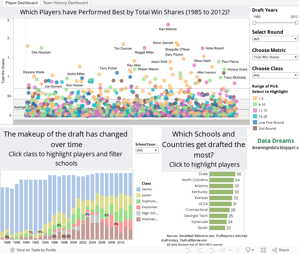
In this viz, you can look at the top players by various metrics (points, rebounds, win shares, etc) and filter by school, country, or class when they entered the draft (high school, freshman, etc). Who was the highest scoring 2nd round pick of the lottery era?(Cliff Robinson- over 19,500 points!)
What school has had the most seniors drafted in the last ten years?  (Duke- 8 total, 5 in the first round)
Who was the best player drafted out of Louisville?  Pervis Ellison?! (As a Kentucky fan that absolutely cracks me up).

You can also check the draft history for every NBA team. Since some players are traded on draft night I used the acquiring team for this view. This view can show why some teams stay strong- the Spurs drafting Tony Parker late in the first round- and why others continue to struggle- Peja Stokavic being the best draft pick of the Kings.

For the player dashboard page, I used the "jitter plot" style featured on Data Revelations recently to separate the players spatially. Check out the viz below or see it in action here.